What just happened? Microsoft is doing something it's only done once in 15 years: replacing its default Office font. The long-used Calibri is being swapped out for a new font called Aptos, which has been chosen based on years of user feedback.
Microsoft writes that its 15-year relationship with Calibri has come to a natural end. The font replaced Times New Roman across Microsoft Office back in 2007, but the twilight of its reign started in 2021 when the Redmond company commissioned five original, custom fonts to replace Calibri, asking users to choose their favorite default option.
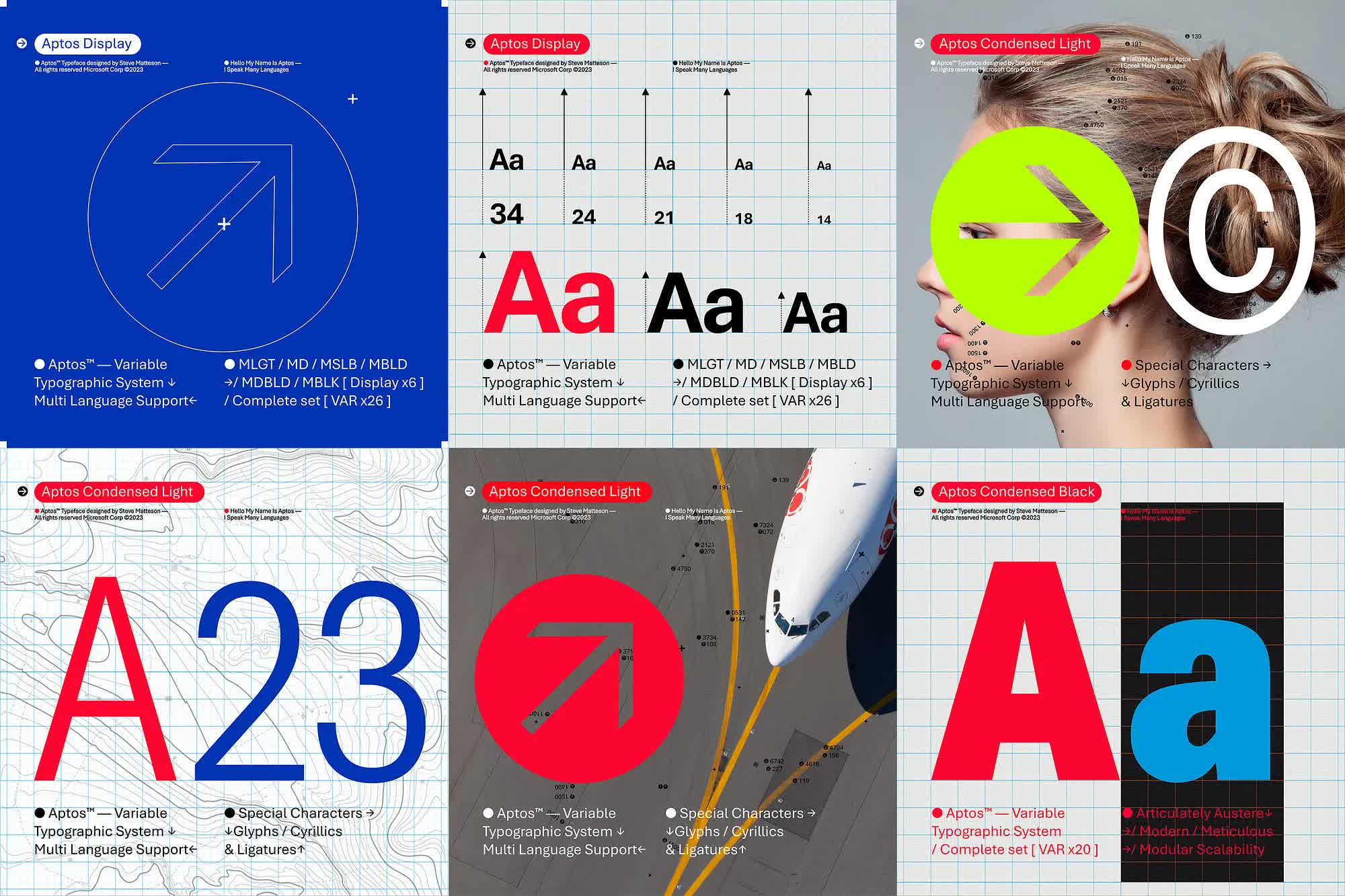
Of the five chosen fonts - Bierstadt, Grandview, Seaford, Skeena, and Tenorite – Bierstadt was picked to be the default for Microsoft 365, though all of them were added to the drop-down font picker for users. The typeface, inspired by mid-20th-century Swiss typography, also underwent a name change, becoming Aptos, though it will be in the drop-down picker under its original Bierstadt name for "those who just aren't ready for the font's new name."
Si Daniels, a principal program manager at Microsoft, writes that the company is in the final phase of the change where Aptos will start appearing as the default font across Word, Outlook, PowerPoint, and Excel. It will be rolled out for all customers over the next few months.
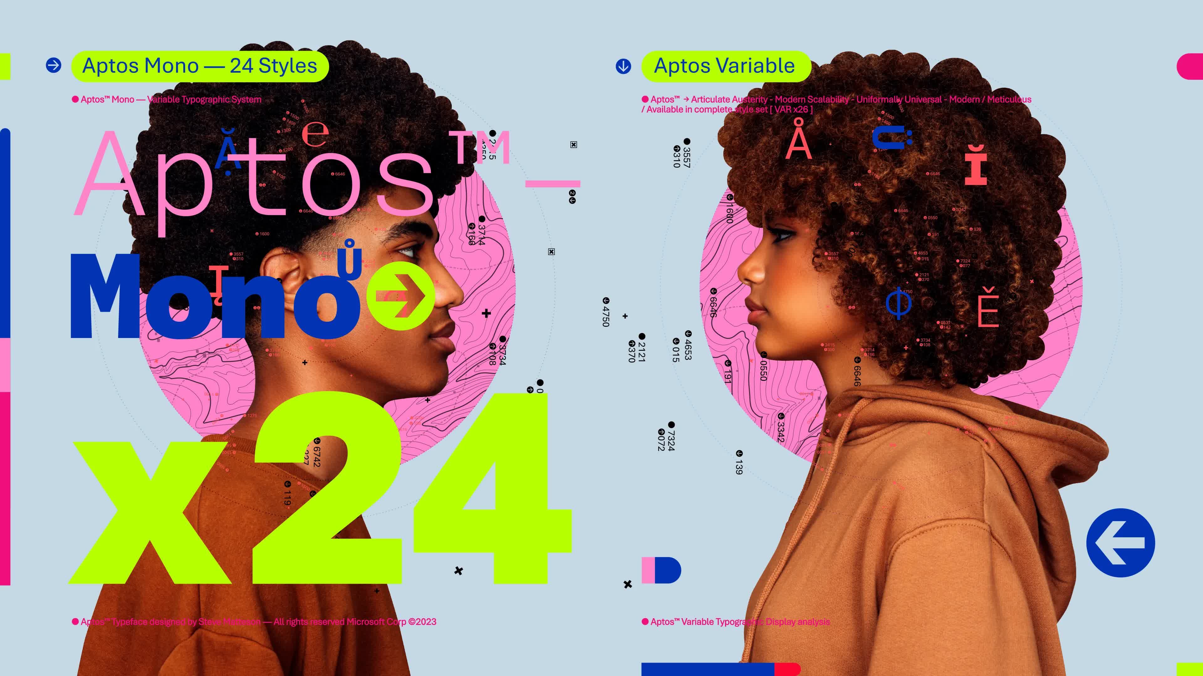
Aptos is a sans serif, also referred to as Grotesque or Gothic, which has simple letterforms and is easily readable. It's made of varying geometric shapes and described as bold, well-defined, directive, and constrained. Daniels adds that subtle circular squares within the letters' contours allow higher legibility, especially at small sizes.
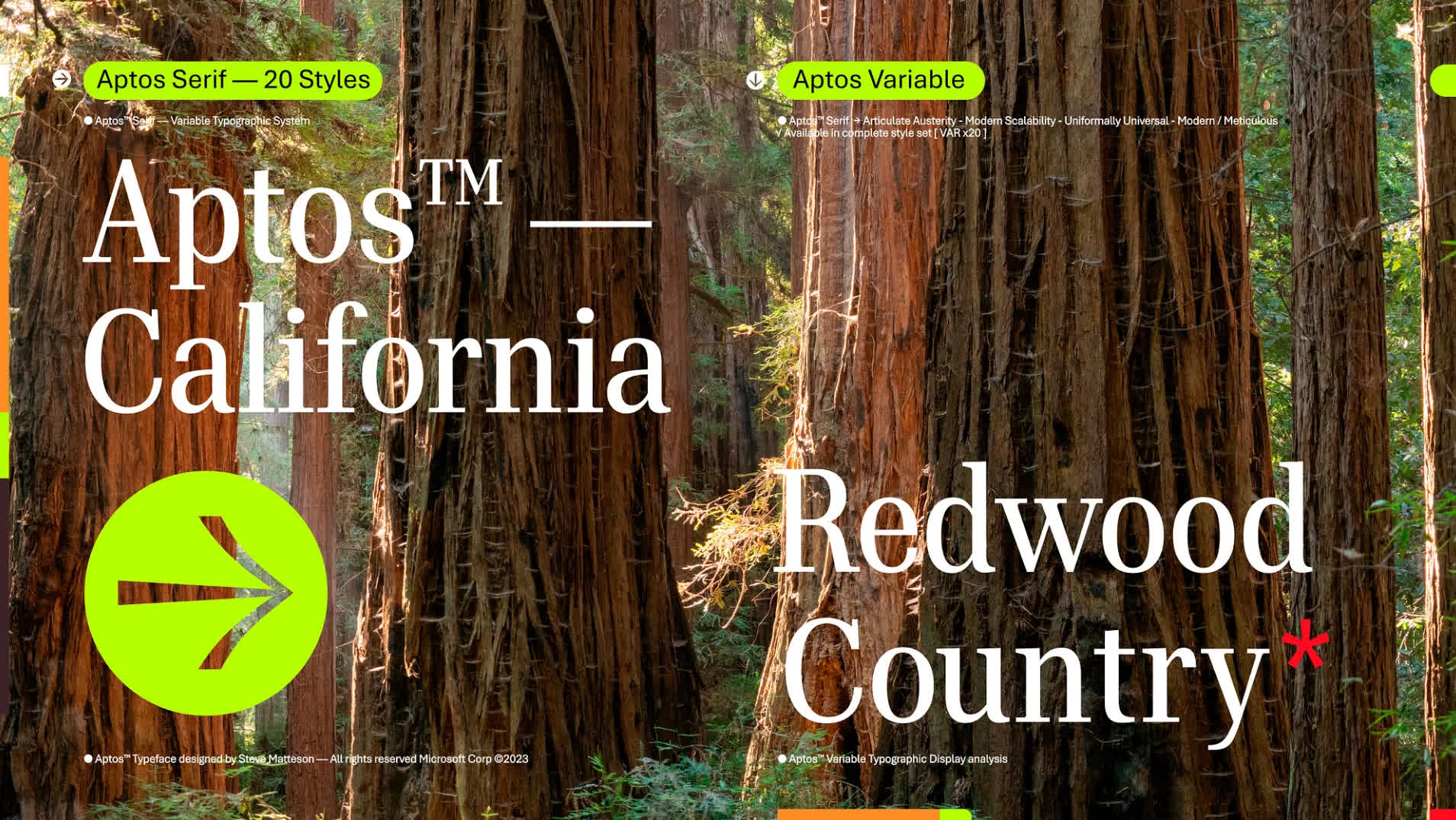
Aptos was designed by Steve Matteson, a type designer who developed the original Windows TrueType core fonts and created the Segoe font family. He has designed more than 80 typeface families including brand families for Toyota and Google. Matteson renamed Bierstadt to Aptos, after his favorite town in Santa Cruz, California.
So why change the default font now? Microsoft says it is to adapt to evolving technology, such as higher-resolution screens, for which Aptos is called the perfect font. "The font needed to have sharpness, uniformity, and be great for display type," Daniels explains.
Daniels said Aptos is part of a broader range of features coming to Microsoft 365, a push to make the software more expressive and inclusive. "There's a newly designed font picker experience, along with new themes, colors, and backgrounds," he wrote.
For those who aren't fans of Aptos, users can still change the default font to their favorite.