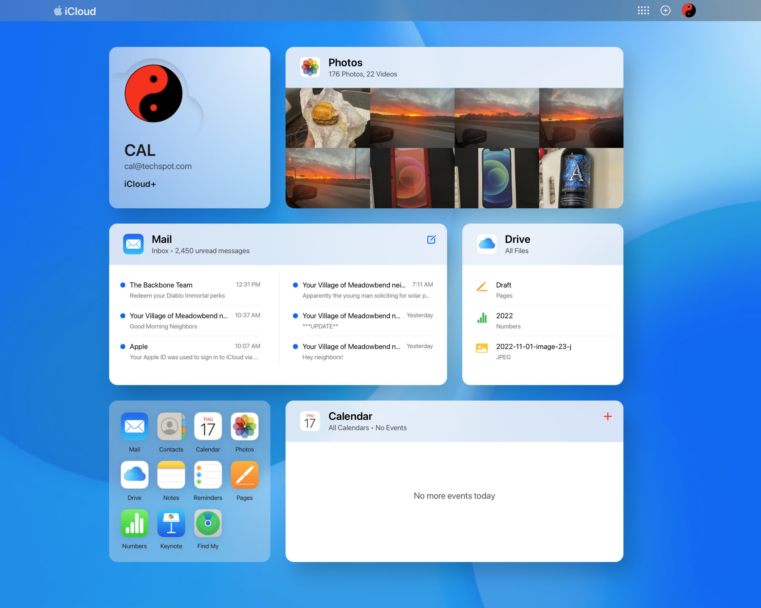
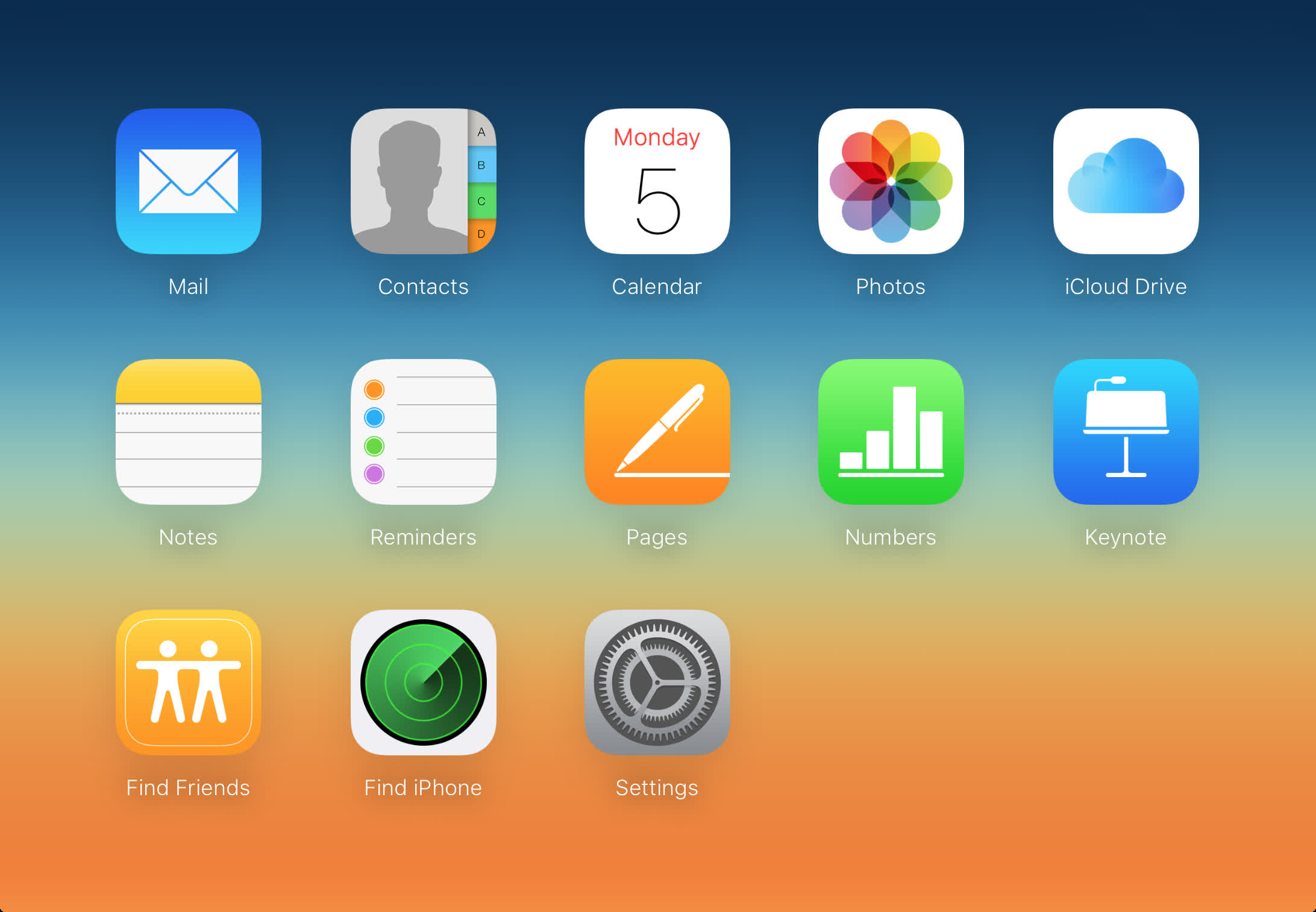
What just happened? Apple implemented a few changes to the iCloud website that modernized its look and feel several weeks ago. The new visual style somewhat mimics an iPad home screen. The experimental version was in beta until today.
Apple's iCloud website has always felt like an afterthought. In its early days, there were only a handful of things it could do. Primarily it served as the hub for Find My iPhone (now Find My) --- a place to go to look up your phone's location if it got lost or stolen. It also allowed users to lock or wipe their device if it was the latter. It had Calendar, Photo, and a couple of other iPhone apps you could access. Prior to that, iTunes acted as an iPhone/desktop syncing platform.
As time passed, Apple added more applications, including Pages, Numbers, and Keynote, which you could edit on your desktop computer and sync to your mobile devices or vise versa. Eventually, those apps allowed documents to have multiple-user access and seamless syncing.
Despite the evolution of functionality, the website maintained the same plain-looking iPhone-1 appearance --- a set of iOS icons on a plain background. Apple finally updated the site's visuals and rolled them out to all users on Thursday. We first noticed the remodel over a month ago, but that was limited to a handful of iCloud+ account subscribers.
The new look features widget-like boxes called "Tiles" that are not dissimilar to those you would find on your iPad or iPhone home screen. There is one with your name and avatar at the top left, which opens to your Apple ID profile settings when clicked.
A Photos Tile shows how many images and videos are on your camera roll, and eight of the most recent are thumbnailed. Clicking the widget opens the full Photos app while clicking a thumb does the same but with that picture selected.
A Mail widget shows your most recent six emails previewed. Opening it works the same way as Photos --- clicking an email opens it in Mail. Clicking the Tile itself opens the app to the inbox.
There are additional Tiles. Mine included Drive (iCloud storage), Numbers (with the six most recent files), and a small compartment for all accessible apps. However, other users' defaults may differ based on the apps they use most frequently.
Regardless of which Tiles show for your account, they are entirely customizable. Click the "Customize Home Page" at the bottom of the screen, and everything will jiggle as it does on the iPhone and iPad. You can add more tiles with a button at the top of the screen, delete them with the X button in their corner, and rearrange them to your liking by dragging them. Then click done to save the changes.

