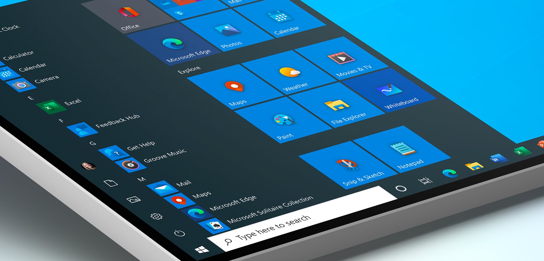
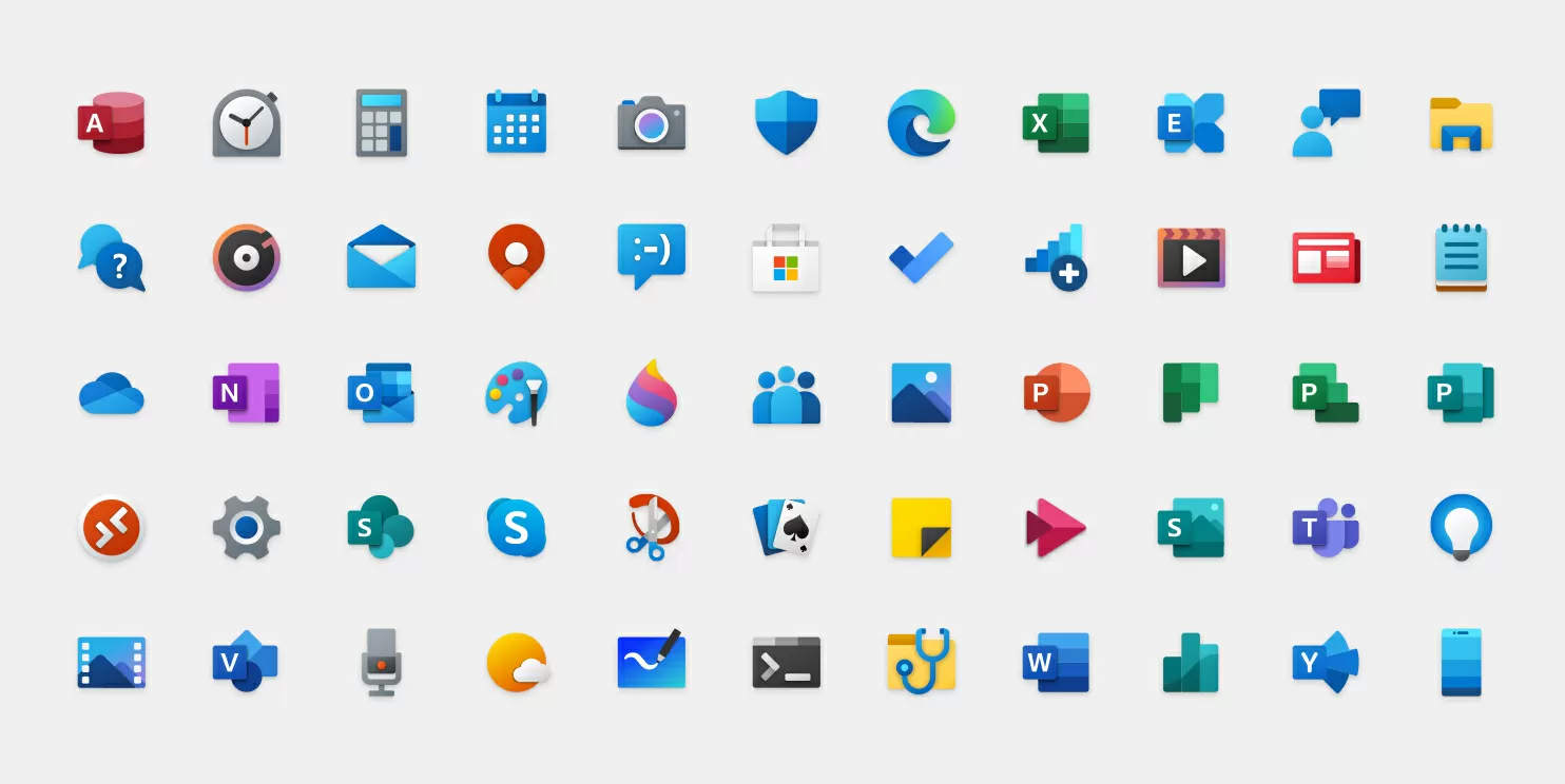
The big picture: Microsoft's monochromatic app icons have spent quite some time in Windows 10, but things are soon set to change for consumers, given that the company started pushing out new colorful icons to users in the Windows Insider program. The changes come as part of a design revamp meant to visually unify Windows 10 with Microsoft's offerings on other platforms, and more importantly, with the company's own foldable-friendly Windows 10X coming later this year.
We learned about Microsoft's plan to redesign 100+ Windows app icons in December last year, with a few of them appearing in Windows 10X preview screens. The company's Office apps made their Fluent Design transition even before that, and now other icon redesigns are making their way to Fast Ring insiders, meaning that a sea of Windows 10 users will soon get to experience them as well.
Alarms & Clock, Calculator, Calendar, Groove Music, Mail, Movies & TV, and Voice Recorder are the first built-in apps to get new icons, with plenty more to follow. They all bear consistent design cues like rounded corners and color patterns of the company's fluent design language, and it would be nice to see this visual uniformity reflected across more places in Windows 10, even if Microsoft's primary focus seems to be redesigning its cross-platform apps.

In her Medium post, Microsoft's Design Leader for Windows and Devices, Christina Koehn, discusses the evolution of Windows and its icons and notes that with four connected devices per person (estimated), there is a need for simplicity at the systems level for Windows designers. She also comments on Windows 10's Start Menu and tile interface:
Flat, monochrome icons look great in context of colorful tiles, but as more icon styles enter the ecosystem, this approach needs to evolve. When icons in the taskbar and Start menu are different styles, it creates more cognitive load to scan and find applications. We needed to incorporate more visual cues into the icon design language using our modernized Fluent Design Language.

It remains to be seen how Microsoft evolves the design of its core features like the Start Menu, File Explorer and even the controversial Metro-era tiles interface, among several others, but the new icons should start appearing to Release Preview testers anytime now, alongside a new Windows Update interface that lists optional driver updates from partners to let users decide on their download and installation, giving them more control over updates.
