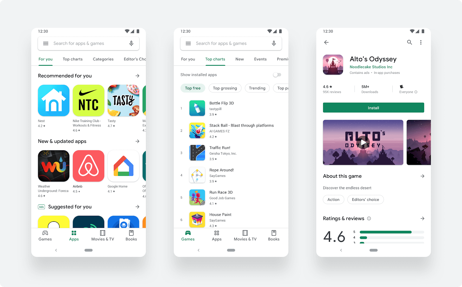
What just happened? Google has rolled out a refreshed Play Store experience that's surely going to brighten your day, especially with its ample use of white, alongside new bottom navigation to separate games and apps and the use of a new icon system for a more uniform and rounder appearance.
The Google Play Store is actively used by over two billion users in a month and with its latest design update, Google wants to make sure it gets those users to their right app, game or other digital content as quickly and smoothly as possible.
Following the company's Material design language, the focus here is to "deliver a cleaner, more premium store that improves app discovery and accessibility for our diverse set of users," says Boris Valusek, Google Play's Design Lead.
Starting with a new navigation bar at the bottom (left for tablets and Chrome OS devices), the updated UI seems to take inspiration from Apple's App Store where it now separates gaming apps into its own category given the popularity of the genre. The resulting listing page for an app now has an updated layout for richer information and more prominent call-to-action buttons whose width spans across the page.
While previous app icons used a "freeform" approach resulting in a variety of shapes, this update also features a new rounder icon system applied uniformly across all apps in the store for a more consistent look that allows for better information presentation and fixes alignment issues for designers so they can focus more on their app icon's artwork.
