Google has given us an idea of where Chrome's future user interface is heading. In the latest version of Chrome Canary for Windows---an unstable, daily version of the browser used for testing new features---the company has added refreshed material design options.
The new design comes under the general label of Material Design 2; the name first used in a Chrome commit earlier this year. Material Design, for those unfamiliar, is Google's visual design language that's been around since 2014.
This isn't a major overhaul, but there are a few notable changes, some more appealing than others. There's an emphasis on curves, with the address bar now featuring round edges instead of the current straight lines, but it's the tab design that might be the most controversial change, as they lose their slanted sides and now look like rectangles with rounded edges.
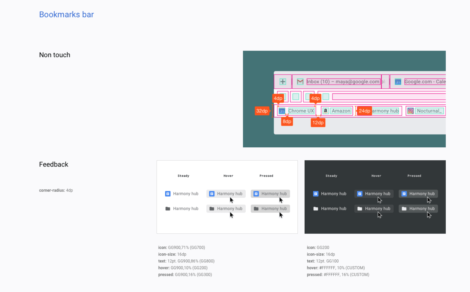
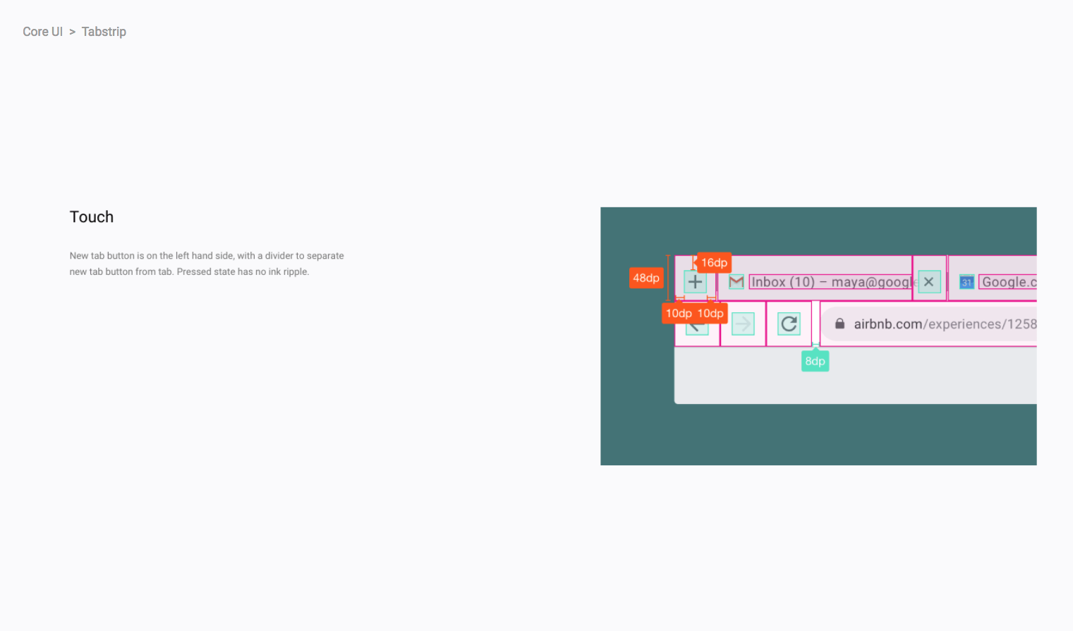
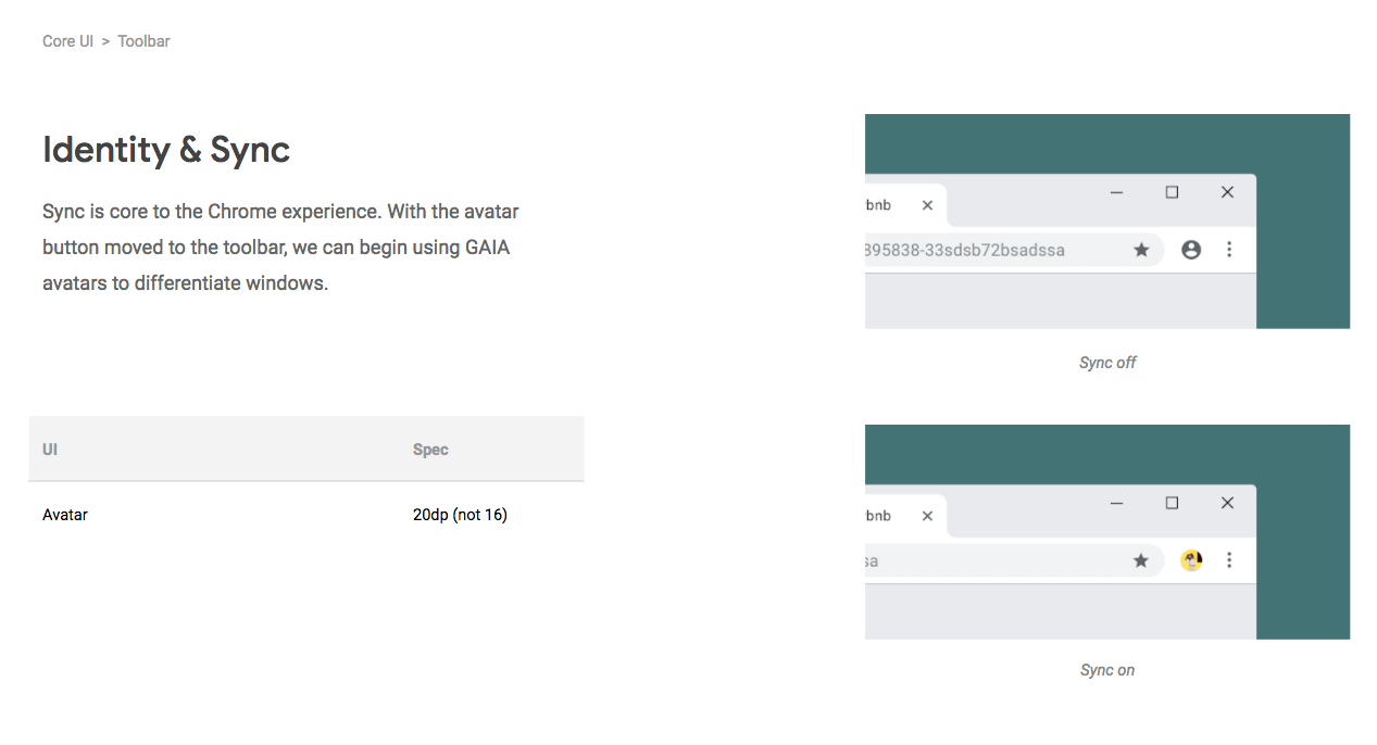
The Profile icon moves from next to the Window controls to the right side of the address bar, while internal design documents show the plus button for opening a new tab has been moved to the far-left, though that hasn't arrived in Canary yet.
The 'Secure' certificate icon has also undergone a design change; hovering the mouse over it will bring up a pill-shaped button and clicking on it will show certificate information and the permission granted to a website. There's also more use of the Product Sans font that makes up Google's logo.
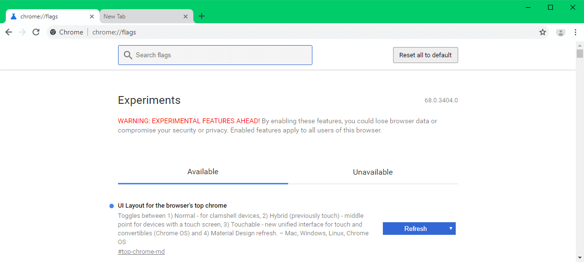
If you want to check out the changes, download the latest version of Canary (68) here. It's then a matter of accessing the 'chrome://flags' page in the URL bar, which contains the experimental options.
We still don't know when the changes will make their way to the standard version of Chrome but expect to find out more at May's Google I/O developer conference.