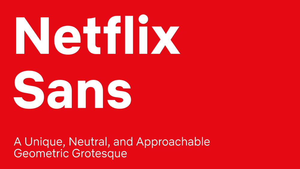
When operating at the scale of a company the size of Netflix, even the smallest of expenses can quickly add up. Take font licensing, for example.
As Netflix brand design lead Noah Nathan highlights, Netflix primarily uses the Gotham font. It's a popular choice in the entertainment industry but as foundries move towards impression-based licensing for digital advertising spaces, it has gotten incredibly expensive to use (in the range of millions of dollars per year). After all, Netflix attracts a ton of eyes.
It's no surprise, then, that Netflix has created its own font.
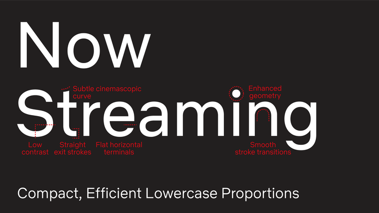
Dubbed Netflix Sans, the unique characteristics of the new typeface were crafted specifically to serve both functional and display purposes. It'll save Netflix millions in expenses per year but perhaps more importantly, it gives Netflix more ownership over its brand aesthetic.
The clean and neutral lines give without taking, favoring art over distraction, and eliminating excess. The arched cut on the lowercase "t" is discreetly inspired by the cinemascopic curve that is so iconic to the brand's wordmark and symbol.
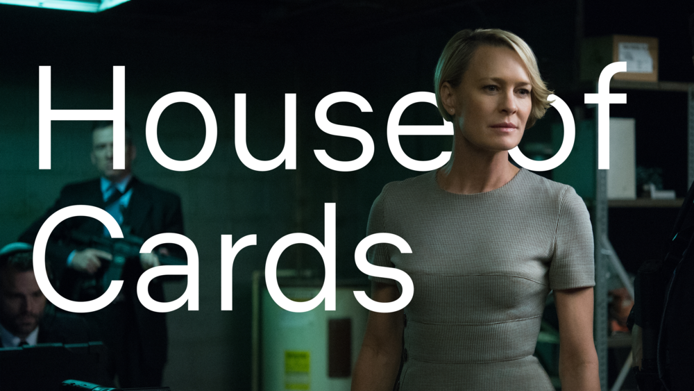
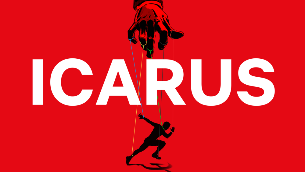
Below are some additional samples of Netflix Sans supplied by Nathan.
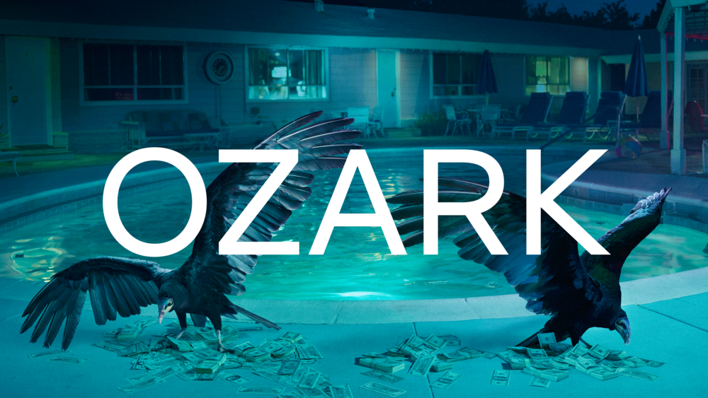
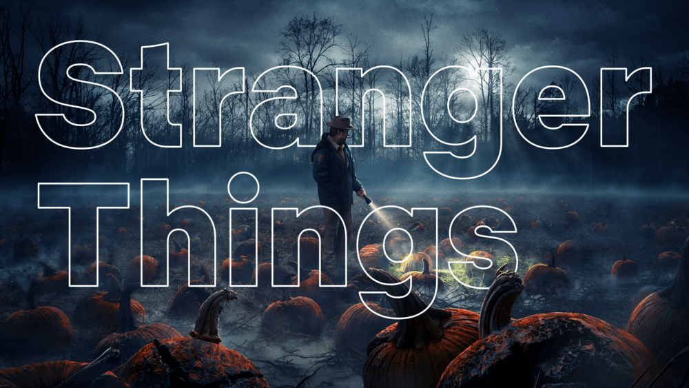
Design leads: Tanya Kumar, Noah Nathan
Product design consultants: Andre do Amaral, David Gallagher
Integrated production: Monique Adcock, Tanya Kumar
Foundry partner: Dalton Maag
