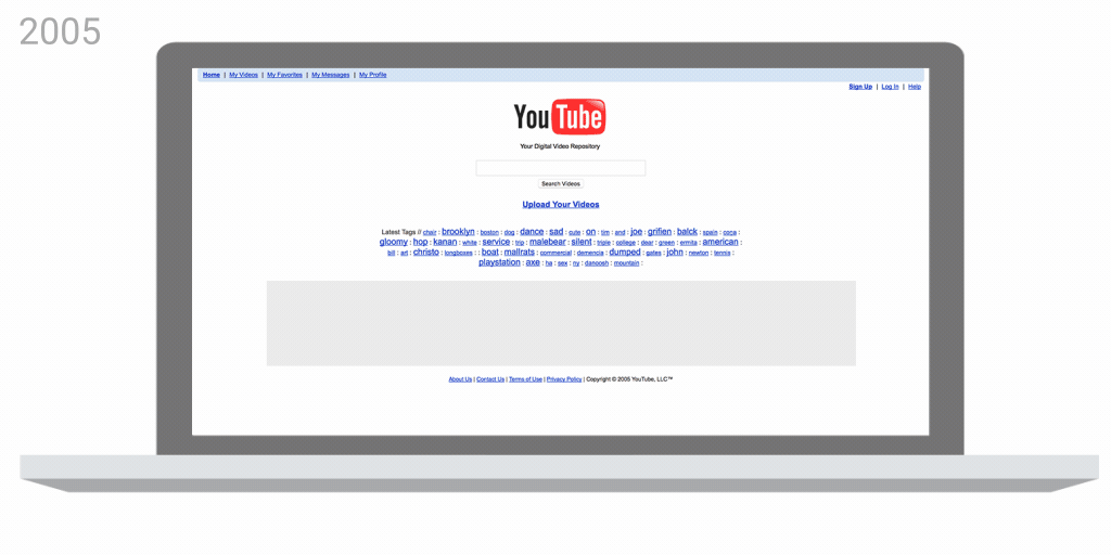
YouTube has come a long way since its humble beginnings in early 2005. Whereas the site originally only supported 320 x 240 resolution clips at an aspect ratio of 4:3, it's now possible to watch videos on nearly any Internet-connected device in SD, HD, 4K, 360, 3D and of course, live.
The Google-owned video sharing service owes much of its success to its ability to adapt to marketplace changes. That evolution continues today as YouTube has announced multiple design updates (some of which are still in the works) for its mobile and desktop platforms.
In the mobile app, YouTube has made the header white and moved the navigation tabs to the bottom so they're closer to your thumbs. It's now possible to adjust the playback speed on mobile devices just as you can on the desktop and check out suggested videos while you're watching in full screen.
Soon, YouTube will automatically change shape to match the video format you're watching for the best possible viewing experience (vertical videos with no black bars on the sides, YouTube promises). In the coming months, you'll also be able to jump between videos with a simple hand swipe (swipe left to view the previous video or right to move to the next in queue).
YouTube in May announced a preview for its new desktop design and today, it's rolling out worldwide. If you recall, the desktop refresh is based on Google's Material Design and includes more white space, a smaller search bar, a decluttered sidebar menu and a new Dark Mode.
Last but certainly not least is a refreshed YouTube logo and icon that's designed to look good on even the smallest of screens.